Best Practice - Optimising Projected Image Contrast
HTE is known for its beautiful interior design and integrated acoustics. One of our guiding missions is that entertainment room design should be complete and holistic, ensuring that every interior design and technical element comes together to deliver the overall immersive and human centric experience. We often help our dealers with the engineering of the technical package (We supply the room, our dealers supply, install and calibrate the technical package) and though we’re known best as the acoustic experts, we also work really hard to optimise the video performance of the rooms we build with our integration partners.
The audio world is very subjective. Ask 10 acousticians for a solution for a space, and you’ll get 13 different answers. Ask 10 video specialists, and you’ll likely get a similar answer from all of them. Video performance is very objective and can be relatively easily measured and verified. REC709, P3 and BT2020 are what they are; colour accuracy is not up for debate. What is up for discussion just like it is with audio, is dynamic range. In audio, this is defined as the the difference between the smallest and largest measurable reproduced signals. In other words, can you hear everything from the quietest sounds over and above the rooms acoustic noise floor, right up to the loudest sounds at full frequency bandwidth as the director intended. Video is quite similar, with the dynamic range being from showing the blackest blacks to the brightest whites. As with anything in our industry, there are the impressive marketing numbers, and then there is the reality.
When manufacturers of projectors specify contrast, they often do this as ‘Dynamic Contrast, or Frame Sequential. This is the theoretical difference between the projector showing a full frame of black, vs showing a full frame of white. The number for this can be in the thousands. I’ve even heard one very well known manufacturer state that their top projector has infinite contrast (😂😂😂). These make great numbers for marketing, but are not the most important specification for 99% of entertainment content.
The more relevant and important specification is system ANSI contrast. System, in that it’s not just the projector, but also the entire environment that it is being used in. To measure ANSI contrast, a checkerboard pattern is used that has 50% of the screen as black, and 50% as full white. This is FAR harder for a projector to deliver than full on/full off frame sequential.

An ANSI Contrast Ratio Measurement Pattern
It is extremely rare that entertainment content is ever a full white or full black frame. Even that famous episode from Game Of Thrones, where many who watched it on poorly setup displays just saw nothing because the scenes were shot in near darkness, had brighter parts.
The reasons for ANSI contrast being the most relevant for actual content, are as follows -
Humans are very bad at perceiving absolute bright and absolute dark. When we go outside, our irises close and chemical changes in our eyes mean we adapt to the brightness. When we then go into the dark, our irises open up and those chemical changes are reversed. When we are watching a screen, what we perceive as a ‘bright and punchy image’ is mostly down to contrast and not absolute brightness.
Keep in mind that a 50fl (Foot lamberts - The measurement of how much light is reflected back to our eyes from a screen) projected image is considered bright. The image you get at a commercial Dolby Cinema with Dolby Vision has a peak white of around 33fl and that’s considered the finest projected image quality available. 50fl is 171 nits (One nit is 1 candela per sq m and is the measurement of brightness of an emissive display such as an LCD or OLED). When we consider that today’s TVs are capable of over 1000 nits, that projected image isn’t so bright any more and the quality of its image is all down to contrast.
When a projector is projecting actual content, the projectors optical system quality is critical. As light passes through glass, most of it passes through, some gets reflected (which is mitigated with multi-layer anti reflective coatings) and some of it is dispersed through the glass element reducing contrast.
Where there are bright parts on the screen, that light then shines into the room, and is reflected back from elements in the room back onto the screen. This profoundly affects how black the black parts of the picture is. This is the reason that projected image quality is hugely affected by room design. Though its not a contrast discussion, if the room has coloured surfaces, light from these will reflect back onto the screen and ruin both colour, as well as colour uniformity.
It may surprise you to find out that the actual ANSI contrast ratio achieved in most home entertainment spaces is rarely above 100:1 and this will drop to around 40:1 if you have any lights on (with one caveat as discussed below). A few years ago I was teaching a class on lighting design for home cinemas and I asked the attendees to guess what the contrast ratio was on the projection screen in the convention centre teaching room. I had answers between 100:1 up to 50,000:1 (😳😳). We then put up an ANSI Pattern and with a Jeti Spectraval 1511 Spectroradiometer measured all the black parts and averaged them. Then measured all the white parts and measured them. The averaged white luminance was then divided by the average black luminance to give us the projected image system contrast ratio. It was 2.7:1. Needless to say, the class was surprised.
There is an excellent ANSI/Infocomm standard for projected image contrast ratio. It is available here - https://www.avixa.org/standards/image-system-contrast-ratio In the standard there are different viewing requirement categories. For Full Motion Video it states a minimum of 80:1 is required.
Achieving this system specification in-room is a combination of many things -
Projectors have now evolved to a point that the technology used has little effect on ANSI contrast. D-ILA, DLP, LCD and LCoS can all produce fantastic images. It is worth noting that the majority of projectors used in professional cinema grading suites are 3-Chip DLP.
Screens matter but specification is a balance of compromises. There are now some superb ALR (Ambient Light Rejecting) screens available. These work amazing well in higher ambient light environments to deliver better contrast by using an engineered screen surface that does not reflect light coming in off-axis. The compromise is, however, that these screens do not offer as good brightness or colour uniformity, especially for viewers not sat in the middle, as a perfect Lambertian diffuser screen. In rooms where the interior design calls for lots of windows, white walls or reflective surfaces, the compromise can be a good one as contrast is so important.
The design of the room and its finishes matters. As described above, subdued neutral tones are far better than white, or bright colours.
The lighting design for the room is important. For serious movie watching, switching all the lights off will deliver the best contrast, but sometimes this is not possible. Good cinema lighting design practice includes -
Keep all direct light sources off the screen. No part of the screen should have direct line of sight to any specular light sources - They should all be diffused and preferably reflected off a surface.
For lights that are on during viewing for safety and social reasons, ensure they are dimmable. If possible, these lights should be D65 so when they are on, though image contrast will be reduced slightly, the white balance of the image will not be affected.
Make use of the photometric data available for light fittings. Use this date to ensure that light is kept off the screen.
When using an acoustically transparent screen, the area behind the screen should be flat black. If the screen is of a woven or knitted type, it probably comes with a black scrim/backing. This is used to ensure that no light gets through the screen to then be reflected back onto it from behind and cause a loss in contrast.
The projector needs to be bright enough… Most projector specs state the absolute maximum brightness of the projector without worrying about colour or white temperature. When you are speccing a projector, find out what the ACTUAL light output is when calibrated to D65 white, and P3 colour. If the projector cannot reproduce 100% of P3 colour, then it is unable to reproduce HDR correctly. If the projector uses a lamp rather than laser as the light source, check what the output is after 300 hours of lamp use. Laser light sources are now becoming common at the medium and high end of the market and enable projectors to have greater colour volume (Volume = colour gamut + brightness). Our recommendation is that to deliver good HDR, the projected image taking into account screen gain, and the projector calibrated to D65 and P3 should be at least 35fl and preferably closer to 50. This is tougher than you might expect, especially when screens get larger.
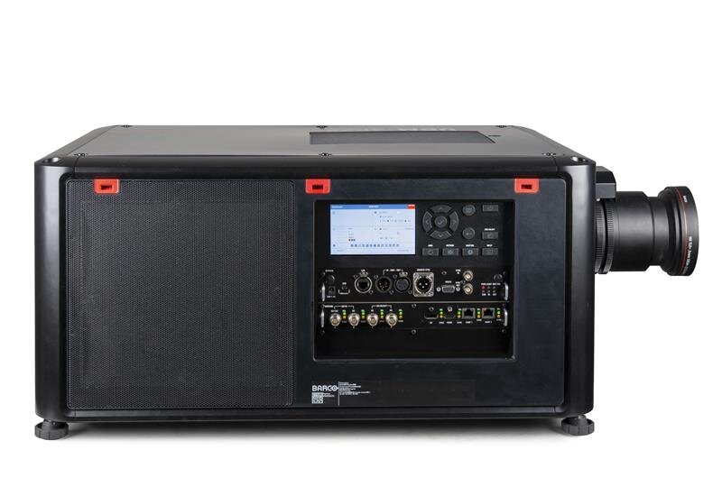
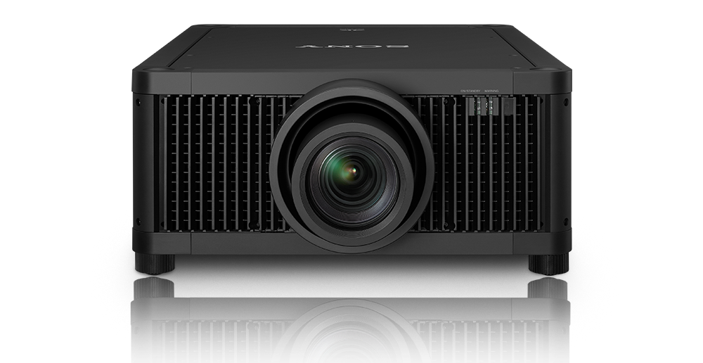
Projectors such as the BARCO Njord and Sony VPL-GTZ380 offer 10,000 Lumens+ at P3 colour and enable HDR on larger screens in high-end rooms.
If you want to know more about the science of imaging, and learn about the engineering that needs to go into achieving an amazing image, CEDIA and The Imaging Science Foundation (ISF) have a fantastic online course. You can find out more about it here - https://cedia.net/education-events/education/isf-training
Designing the video system for a high performance entertainment space is a true engineering exercise that transcends ‘this is the best projector’ marketing. It is a combination of design, engineering and specification at both technical and interior design levels.
HTE are able to advise on every aspect of video design and specification if required, and can build rooms that brilliantly balance amazing projected video quality, with human centric beautiful interior design.

With the lights off, dark wall finishes will optimise projected image contrast, brightness and colour uniformity, and remove distracting elements from the immersive cinema experience